
Users of Microsoft SharePoint have often had to deal with multiple user interfaces in SharePoint’s 17-year history. When new versions were released that changed the user interface, Microsoft usually provided options for site owners to stay for a time on their old look and feel, until they were ready to upgrade the look and feel to the new version.
In some ways, we are in a similar situation today with what Microsoft calls SharePoint’s “classic” and “modern” user interfaces, either of which are options when creating a new site collection in SharePoint Online. If you’re unfamiliar with these terms, the “classic” interface was first released in 2012 with SharePoint Server 2013, but for the past couple years, Microsoft has been (slowly) developing a “modern” interface for SharePoint Online to provide its latest facelift, improve the mobile experience, address some of the developer community’s frequent criticisms of SharePoint, and provide a better foundation for the future.
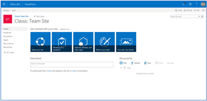
Classic Team Site
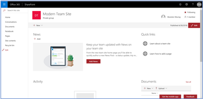
Modern Team Site
Two equally supported alternatives
Efforts like these to “modernize” SharePoint by slapping a new coat of paint on everything and better accommodating the latest buzzwords are nothing new. There was a time, when SharePoint 2013 was first released, that a company could theoretically have three different user interfaces deployed in the same farm.
What is different this time around, however, is that the latest interface is not a replacement, per se, of the old one; it’s an alternative. Granted, it’s an alternative that Microsoft strongly suggests that you use, but if you are on the current on-premises version of SharePoint, SharePoint Server 2016, you can’t even use the modern interface. And even if you’re on SharePoint Online, Microsoft understands that there are certain common scenarios that the classic interface handles easily but that the modern interface cannot (yet) support at all. As such, Microsoft has explicitly stated that the classic interface is fully supported and not at all deprecated.
No upgrade process for existing sites
Another difference is that when Microsoft has released new versions in the past, part of the upgrade process has been taking existing sites and upgrading their designs to incorporate the new version’s interface and look and feel. This time around, however, there is no way to convert an existing, classic SharePoint site fully into a modern site. Microsoft has provided some hints that they are at least considering developing this capability, but so far it’s not on the roadmap.
Instead of upgrading, if you want to take a classic site and convert it into a modern site, you have to create a totally new site and use a migration tool to copy the content and any supported customizations over. In a way, this is thematically similar to the “upgrade” process in the on-prem world for going from SharePoint Server 2010 to SharePoint Server 2013, where there was no in-place upgrade, and instead you had to migrate your databases to a new farm in order to upgrade them. But since we have no access to databases or farms in the cloud world, a “migration” to the new modern interface would instead involve the highest level administrative object we have complete control over in SharePoint Online, the site collection.
Iterative development process
The final notable difference I wish to discuss today is in the way Microsoft is developing the modern UI. Throughout the vast majority of SharePoint’s development history, up until the past couple years, Microsoft has followed a traditional development methodology, where major changes were rolled out all at once as part of a major server release. The new Microsoft, however, has embraced an agile model with continuous, incremental updates across almost all their major products. The effect of this is that the modern UI—while stable, useful, and fun—is nowhere near finished, “finished” being a somewhat outdated and unfashionable term in the software business these days. And so, over the past two years, we have been witness to a steady, slow, and, frankly, at times frustrating development process whereby element-by-element and release-by-release, we watch as the modern UI slowly takes form.
Classic SharePoint is great...but you should stop using it
All of this is a marked departure from what we long-time SharePoint followers are used to seeing. The effect is that, when you’re building out an intranet or collaboration solution today on SharePoint, you now have two fully supported options: you can continue to use the classic SharePoint interface that we’ve grown comfortable with over the past six years, or you can take the plunge and get started on the bumpy road into the future with the modern interface. The classic interface still has an enormous amount of power and flexibility, and is rock solid from a stability perspective. Personally, I find it as comfortable as slipping into an old pair of tennis shoes. However, I believe that it’s time to start turning our attention to the modern interface and, when possible, converting our intranets and collaboration solutions from using the classic interface to the modern UI.
Over the next few posts, I plan to delve further into this topic, discussing the benefits the modern UI offers to mobile scenarios, to those who edit SharePoint pages, in providing better collaboration and social experiences, and in future-proofing your intranet investment.
Comments